
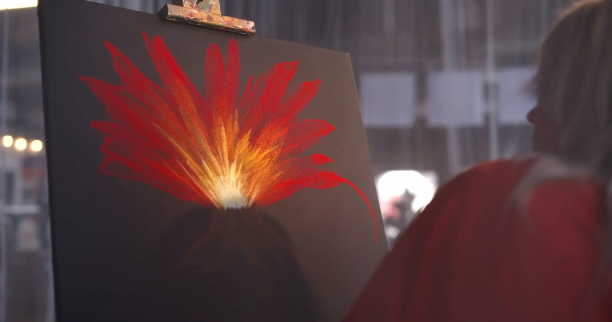
What matters in practice
Between the finished edit and the finished film sits a stage clients rarely look for in a quote and almost always see in the result. Colour grading is where a film gets its palette: contrast, colour mood, the behaviour of light.
The important distinction is from an earlier stage the two are often confused with:
- Colour correction is craft. It evens out what differs: two cameras, a cloud passing mid-interview, a hall lit by fluorescent tubes and daylight at once. The aim is consistency.
- Colour grading is design. It decides whether a film reads as sober and technical or warm and approachable. The aim is effect.
Correction is obligatory; grading is the signature.
Why it starts at the shoot
A grade that holds up is not a matter of a filter at the end but of the recording at the beginning. So we shoot in flat picture profiles with high colour depth. That footage looks pale and disappointing in its raw state but carries reserves. Record an image that already looks finished and those reserves are gone: what has been computed out of a picture does not come back.
That also explains a reaction we see regularly. When you are shown intermediate material or an edit without grading, it often looks washed out. That is not a fault; it is the state before the final step.
What it does for you
Colour is the least conspicuous part of brand management in moving image and one of the most effective. A company whose films carry the same colour signature over years is recognised before the logo appears.